
Knowing your equipment

Chisel nib and round nib
Writing with a chisel nib
The chisel nib is particularly suitable for a really elegant, highly effective piece of handwriting. The tips are wedge-shaped, which means they have both a broader edge and a very narrow edge. Depending on how you hold the pen, you will be able to create a broader or narrower stroke.

Writing with a round nib
The round nib is more commonly used. Whether it be ballpoint pens, fineliners, pencils or felt-tip pens, writing implements generally have a round tip and come in all manner of different stroke widths. Because of its rounded shape, you can hold the pen however you like ‒ the stroke will be the same at all times, allowing you to write lengthier texts with ease.
Using a chisel nib
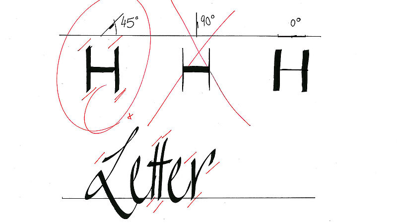
The angle of the chisel nib
The highly expressive style of lettering is produced by holding your nib at the correct angle at all times. The chisel tip should always be positioned at an angle of 45°, for example, in relation to the baseline, whether or not you are drawing vertical or horizontal strokes. This initial angle must not be altered as you write.
“It’s almost as if you have to glue the pen into your hand, in the right position” adds our calligraphy expert.

The proportions of your letters
Something else you need to watch when writing with a chisel nib is the ratio between the stroke width and the letter height. You can achieve a balanced look by drawing four or five stroke widths on the paper, one on top of the other. Lowercase letters such as the “x” should not exceed this height. For this reason, it is a good idea to write relatively large letters if you are using a very wide chisel nib. With a narrower nib, you can write smaller accordingly.
x-height
Ascenders
Descenders
Majuscule
The height of the lowercase letters, not including ascenders or descenders.
The part of a letter which extends above the x-height.
The part of a letter which extends below the x-height.
Uppercase letters ‒ in contrast to minuscule which refers to lowercase letters.
Scripts and different writing styles
Ancient script: Uncial
Uncial is a solid, rather bold, rounded script that has been used since the third century B.C. It was the official script of the Christian church during the time of the Roman Empire. The name “Uncial” comes from “Uncia”, meaning “inch” or “inch-high letter” and refers to the height of the letters. It is a purely majuscule (uppercase) script.
Ancient script: Capitalis Rustica
Capitalis Rustica was used from the 1st to the 5th centuries during the Roman Empire for important manuscripts. Until the 12th century, Capitalis Rustica was used as a decorative script for headlines. Again, this is a purely majuscule script. To reproduce the typical style when writing in this script, you need to turn the angle of your nib to 60°.
Classify your own handwriting
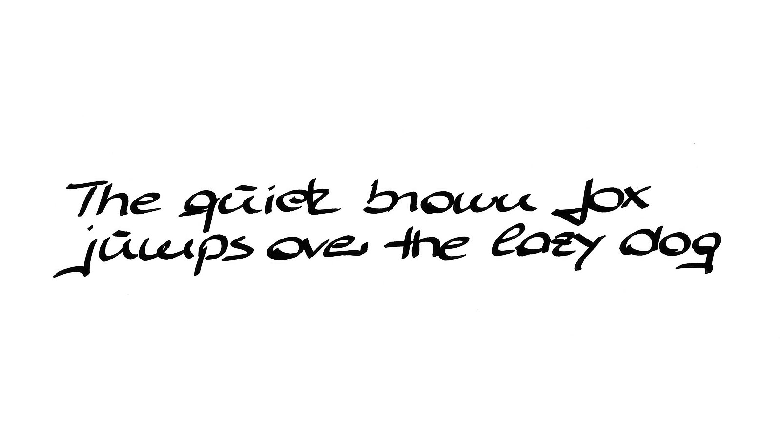
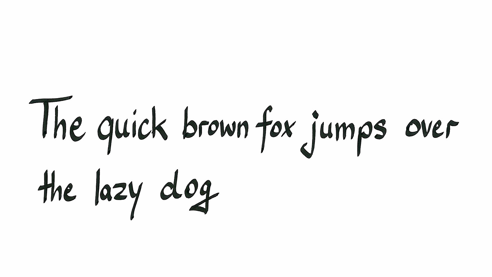
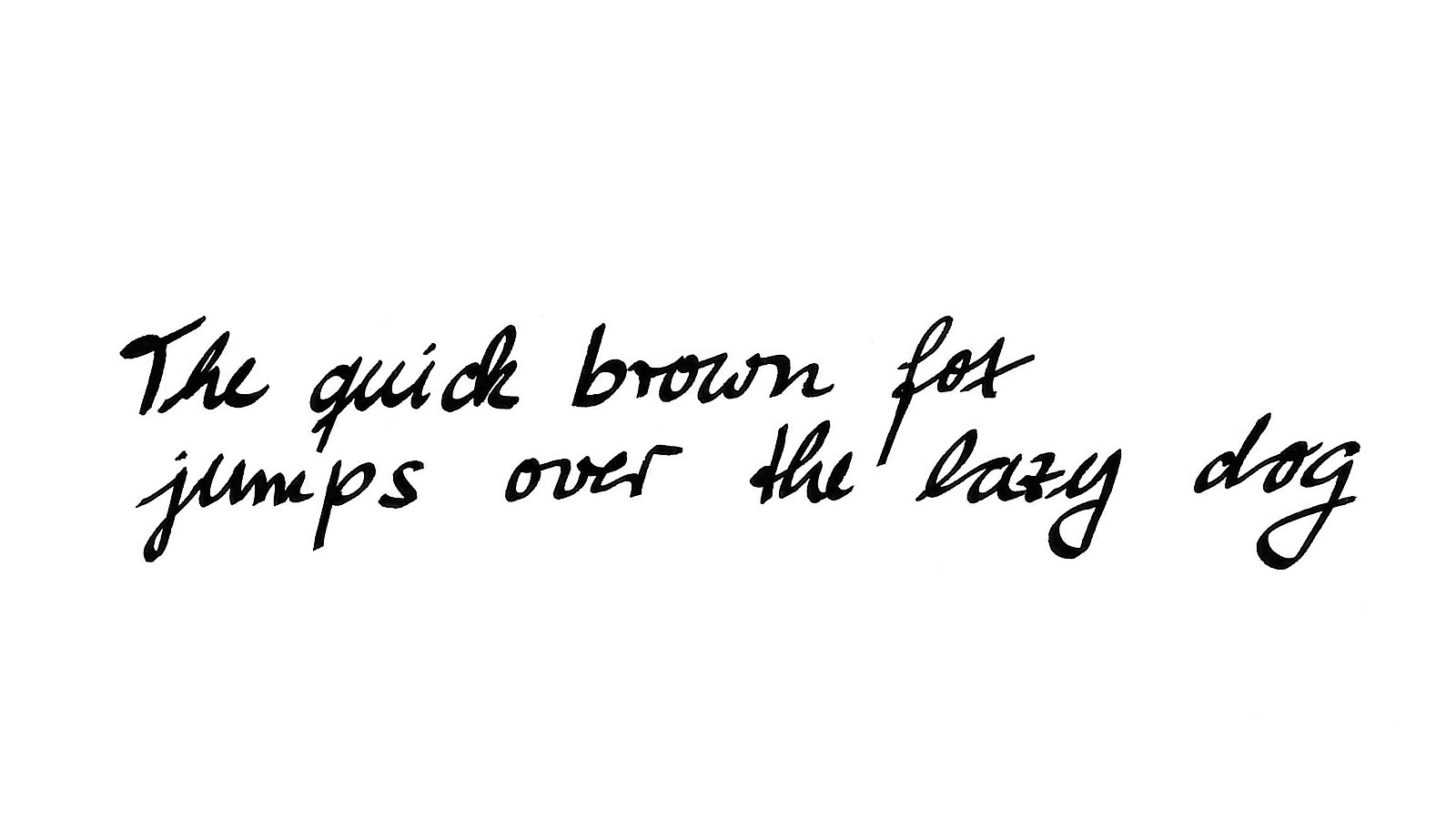
Let’s now take a closer look at free handwriting styles, i.e. your own personal handwriting. We offer tips and suggestions to help you give your handwriting more of a calligraphy-style “finish”. The next section gives you the chance to classify your own style of handwriting. The sentence used in our examples is a well-known English saying that contains every letter of the alphabet: "The quick brown fox jumps over the lazy dog".
Here is what to do: we have provided 3 examples of handwriting styles. Decide which category your own handwriting belongs to, or decide on a style that you like. Then follow our tips and tricks for enhancing your personal handwriting.
Rounded and unconnected style
 Unconnected style
 Pointed and connected style
The individual letters of this handwriting style are relatively flat (low x-height = 3 stroke widths), making the letters somewhat broader, although they still create a clear picture overall. This effect is characteristic of the font and should always be maintained or even improved upon.
A change to the descenders, or “tails”, as in the case of the letters “f”, “g”, “j” and “y” helps make the spaces between letters clearer. Given the low x-height, this gives the lettering better definition. The same goes for the “l”, which ‒ without a loop – fits better with the other ascenders and the clearer style of this script.
The letters “m”, “n” and “h” are easier to read in this form, whilst “u” and “n” are not so easily confused. The effect is all the more interesting if the ascenders are raised even higher than the uppercase letters. For a more interesting effect, you can also get the “r” to protrude somewhat beyond the x-height. With regard to uppercase letters, these suggested changes give the script a more individual style (in particular the “A”, the “M” and the “N”). That’s because the shape of lowercase letters is used – even though they are more akin to uppercase letters in terms of size and correlation.
In this font, the height of the lowercase letters (excluding ascenders and descenders) ‒ also known as the x-height ‒ is equal to five stroke widths (marker widths). It is high and narrow in character, a style you can easily accentuate. The unconnected letters are somewhat straight and relatively close together.
Our expert recommends that you make the x-height even greater to achieve a better decorative effect with this script. The ascenders in a simple, straight form create a nice contrast to the open, clear descenders. The straight ending of the letters allows you to create a clear script.
The height of the lowercase letters (not including ascenders or descenders) for this style of handwriting is 4 stroke widths. By that we mean four times the width of the marker tip. The script is slightly italic in appearance, the letters being connected and rather narrow in appearance.
Our calligraphy expert recommends accentuating the ascenders and descenders to give better calligraphic effect. The shape of the descenders can be adapted to match that of the ascenders to give a uniform picture. In our demonstration, the “s” goes better with the joined-up style. By giving the "r" a more dynamic shape it creates a more relaxed look, with added flourish.
Tips for impressive calligraphy
Different styles of lettering
You will discover all manner of interesting design possibilities if you use different styles of lettering. The results will look highly effective too. Why not choose to work with just small block letters? Alternatively, you might prefer to go for a font with lots of flourishes – it’s entirely up to you.
Effects achieved with letter spacing
By varying the spacing between letters, you can develop interesting decorative styles based on your own form of handwriting that can be combined in a wonderfully creative manner. To do so, all you need is to write a suitably wide connecting line between the individual letters.
Effects achieved with letter height
Special effects can also be achieved by choosing a very high or very low x-height.
Letters with a high x-height should ‒ and can ‒ be narrower and closer together, otherwise the writing could look too cluttered. This also gives rise to a separate, readily identifiable style of handwriting. Using the new waterproof calligraphy markers you can also inscribe containers and decorative objects made of terracotta, metal or stone to great effect.
With a very low x-height, the letters and the spacing need to be a bit wider because it will otherwise be difficult to read. This gives rise to a lettering style of its own.
Practise, practise, practise,...
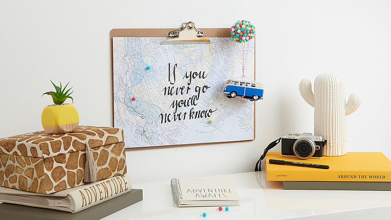
Decorative wall map
Pinpoint your dream destinations
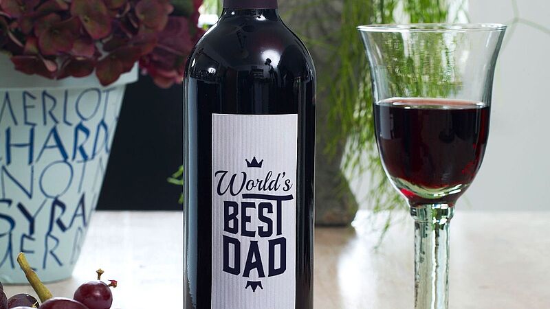
Handmade wine labels
Beautifully designed wine labels - idea for Father's Day
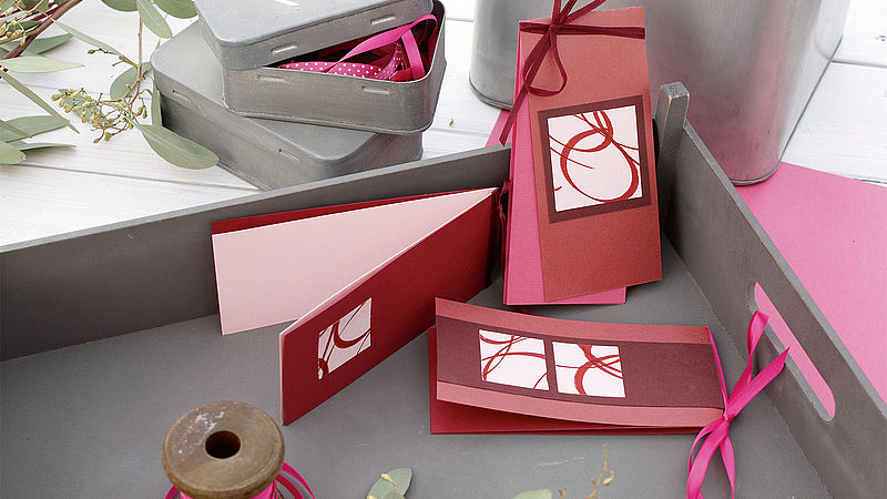
Personalised greeting cards
Luxury folding card designed with edding calligraphy pens
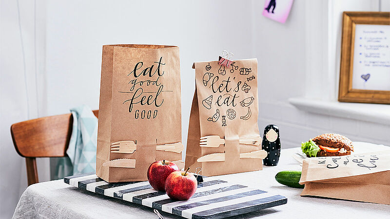
Creative paper lunch bag designs
Packed lunches have never looked so good!
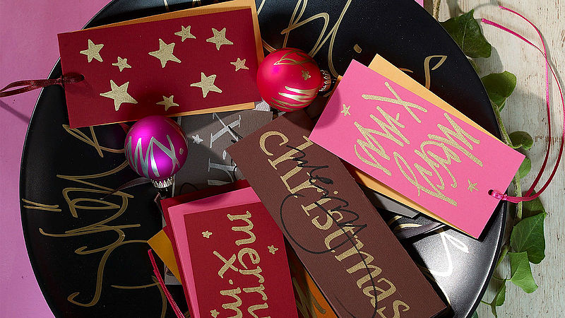
Handmade Christmas greetings
Be creative this Christmas and design your own Christmas cards with edding markers
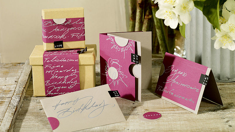
Lovely handmade greetings cards
Silver meets pink with the edding gel roller
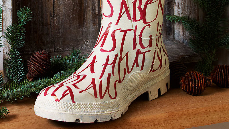
Designer Christmas boots
Have a creative Christmas this year with edding: Turn a wellington boot into a DIY Christmas stocking by decorating it with edding calligraphy markers
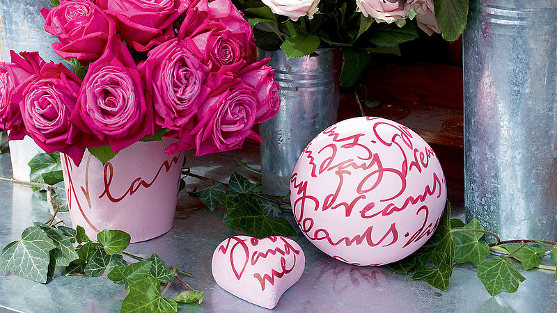
Flower arrangements
Decorative flower arrangements with edding calligraphy markers

Creative card design made easy
Card making with a personal touch - using edding 1200 metallic colourpens