
Lettering styles and tips


Classic: The art of brush lettering
Brush lettering requires specific materials: A good brush pen is essential. With its soft, flexible brush tip, you can vary the width of your upward and downward strokes by changing the pressure of your pen as you write.
For the downstrokes, press firmly on the tip to make them wider – and don’t worry about pushing too hard because quality pens are designed for this! When you move your hand in an upward motion, using the minimum of pressure makes the line narrow again. Learning control and getting a feel for this will take practice. First of all, practise varying the pressure with straight lines and then move on to curves. When you feel confident enough, try putting together a complete word in your chosen font. Do you need some inspiration? Click here.
Tip: Play around and experiment with different fonts and alter the shape of the letters until you’re happy with them.

Where faux is real: Faux calligraphy
Faux calligraphy (or “fake” calligraphy) means writing as though you were using a brush pen when in fact you are using a standard pen with a bullet nib. Fibre pens are suitable, as are fineliners, gel rollers or a pencil. This means you are free to choose what type of paper you want; it could be coloured card or tracing paper, it depends entirely on which pen you go for.
First, write out the word, leaving a little extra space between the letters. Next, draw the downstroke reinforcements that would normally appear when you put pressure on the brush pen – from the rounded peak of the letter down to the baseline. Ensure you always add the parallel line on the same side, either to the right or to the left in order to balance out the word. And because you left a bit of space between the letters, they won’t look squashed together. Finally, simply colour in the empty spaces created – and that’s all there is to it! If you want to learn the basics of calligraphy, click here.
Tip: First, make a preliminary pencil sketch of your faux calligraphy letters, so you can decorate the spaces in between them with dots, lines, etc.

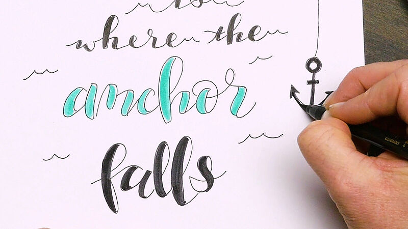
So eye-catching: Bounce lettering
“Bounce lettering” is perfect for giving your letters a spring in their step. You are free to vary the height of the baseline your letters and words sit on – this will give your lettering a dynamic feel.
The bounce technique can be used for many styles of hand lettering and works particularly well with brush lettering and faux calligraphy. There are only a few things to watch out for here: make sure the ascenders and descenders of the letters don’t clash (“f” and “g”, for example). For a more balanced overall look, keep the first and last letters on the same level and only let the middle ones dance around. The layout of the phrase must be compact and the lettering must be consistent from left to right for easy reading. To achieve a contemporary look, use decorative elements to match the style of the wording and the font. It’s important to draw the letters clearly – a “c” with an extended downward stroke, for instance, won’t be legible, and an “a” could soon end up looking like a “q”.
Tip: Draw double letters so they look different from each other to add extra visual interest. You might find practising easier by drawing pencil guide lines first.
Decorate your lettering
A small sketch, shadow lines on individual words or decorative elements can underline the message behind your wording. Flourishes, banners, arrows or swirls – just let your creativity run free!

Let your writing stand out
Use a white pen for dark paper for an eye-catching lettering. The more times you reapply the pastel pen, the paler the lines will become (let the ink dry between applications). You can even add really fine details to your artwork by using the fine tip of the Pastel Pen.
Hand lettering 101 – here we go!
Practise, practise, practise...
That’s enough theory for now – so let’s get started and create our first hand-drawn letters! We recommend you take it slow and steady to start with and avoid applying too many effects all at once; with hand lettering, less is usually more. If your lettering isn’t up to the level of our examples after your first attempt, it really doesn’t matter. Everyone has to start somewhere and you’ll probably need to practise a little before the results come up to your expectations. It’s well worth being patient, though – trust us!
You may wish to sketch your lettering artwork out in pencil first and then go over it with your preferred choice of markers and pens for lettering. You can find our fabulous selection of templates for lettering and tracing in the templates section.
Design your own lettering artwork
Learn hand lettering and put your favourite sayings centre-stage by playing with different lettering techniques
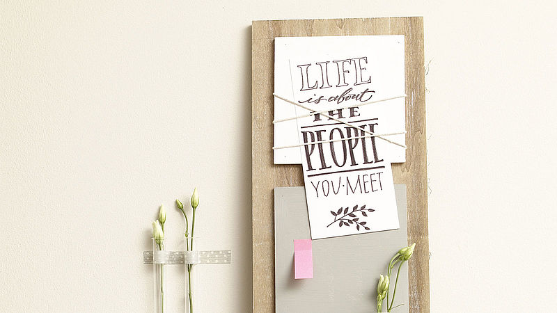
Hand lettering on pinboard
Decorative idea featuring your favourite quotes
Handwritten lettering artwork
Brush lettering for fun
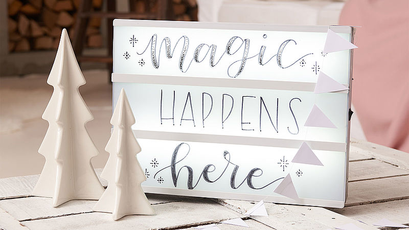
Light box for Christmas
Create your own light box for truly magical moments
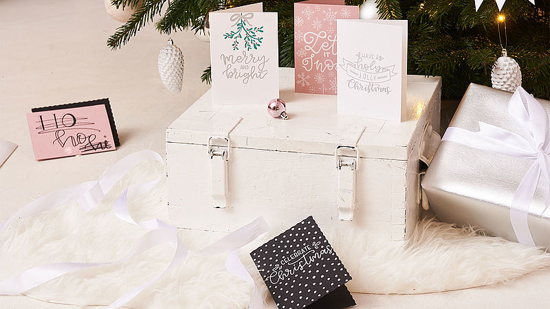
Hand lettered Christmas cards
Craft your own Christmas cards for family and friends

Welcome your guests with this DIY welcome sign
Hand-lettered welcome sign for an inviting hallway

DIY diary cover decoration
Make your diary uniquely yours
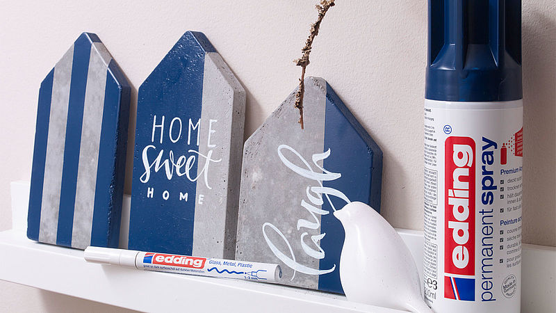
Hand lettering on concrete
Concrete home decor is becoming increasingly popular
Hand lettering markers and pens


A little list of materials
- Fineliners are good for drawing tall, narrow letters
- Gel rollers make it easy to insert a second line as a decorative element
- Fibre pens are great for adding shadow lines to the letters
You’ll soon see the huge scope available for creative experimentation and for playing around until you find your own style. More or less any pen is suitable; you just have to choose the right paper to match.