
Выразительно!
Визуализация делает презентацию интересной и доступной для понимания. Однако зачастую совсем без слов не обойтись. Эти советы помогут вам эффектно, выразительно и отчетливо представить аудитории также и письменные материалы:
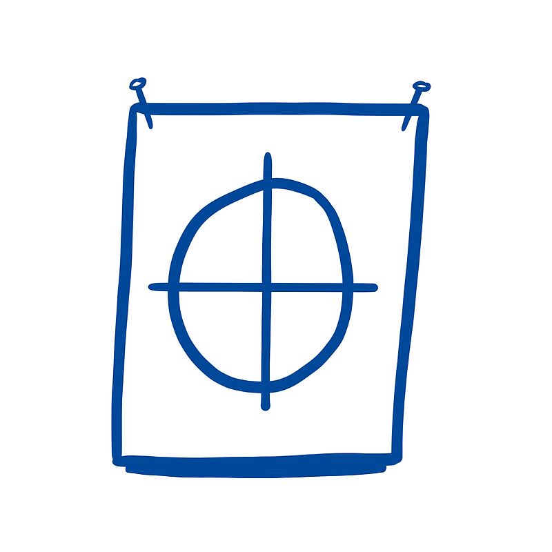
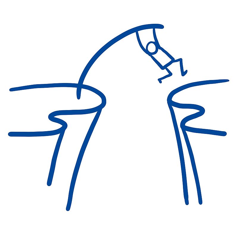
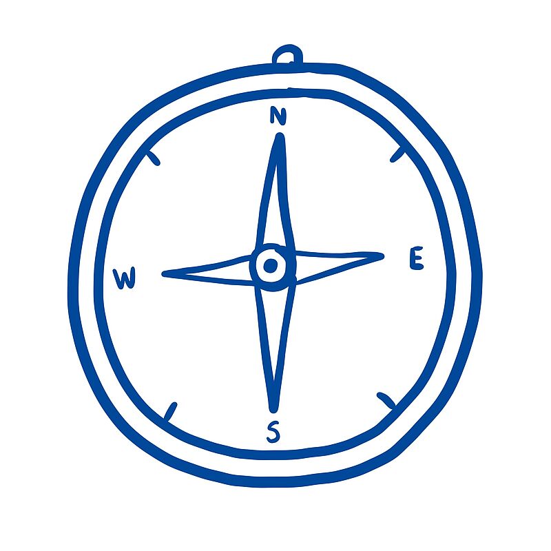
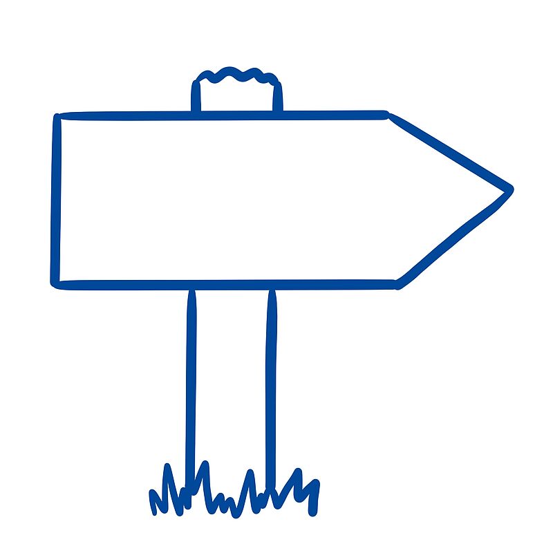
Goals and challenges
Click on the image to get a step-by-step explanation on how to draw your scribble.


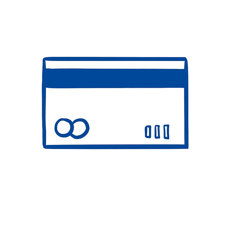
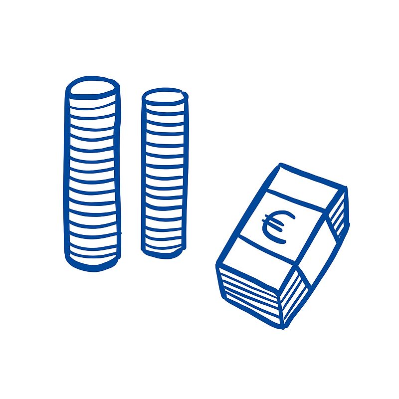
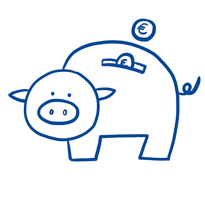
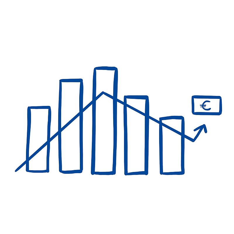
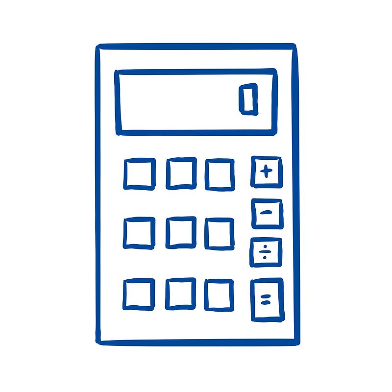
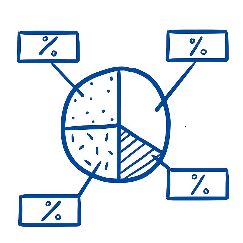
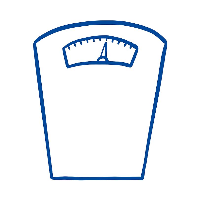
Money and Economy
Click on the image to get a step-by-step explanation on how to draw your scribble.


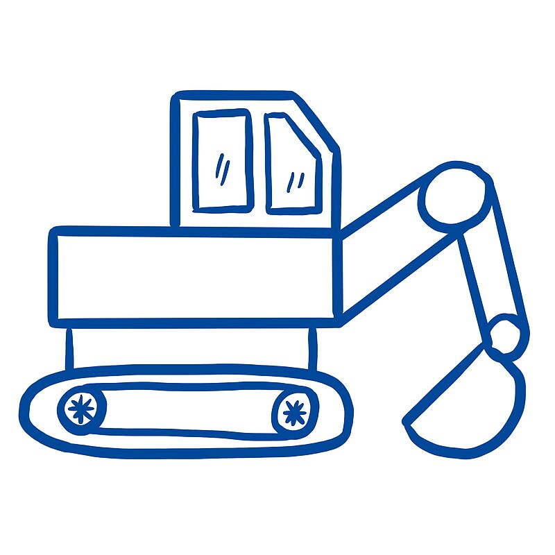
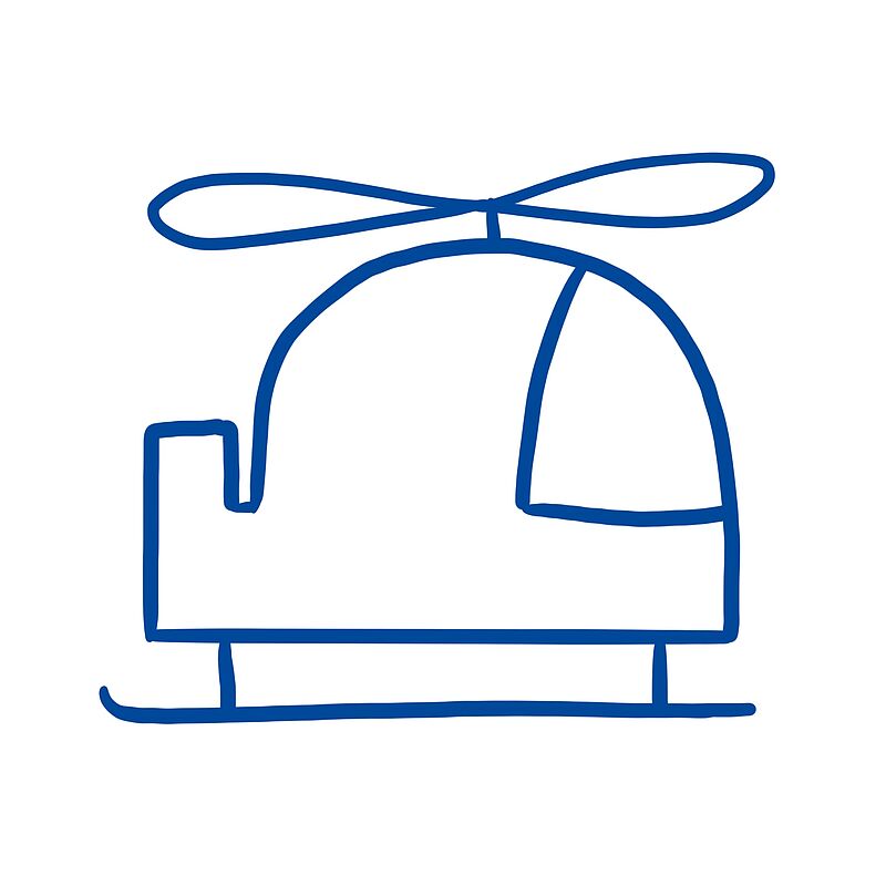
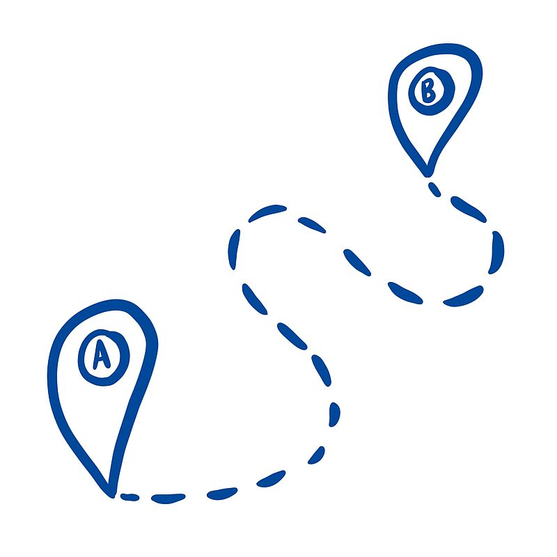
Moving
Click on the image to get a step-by-step explanation on how to draw your scribble.


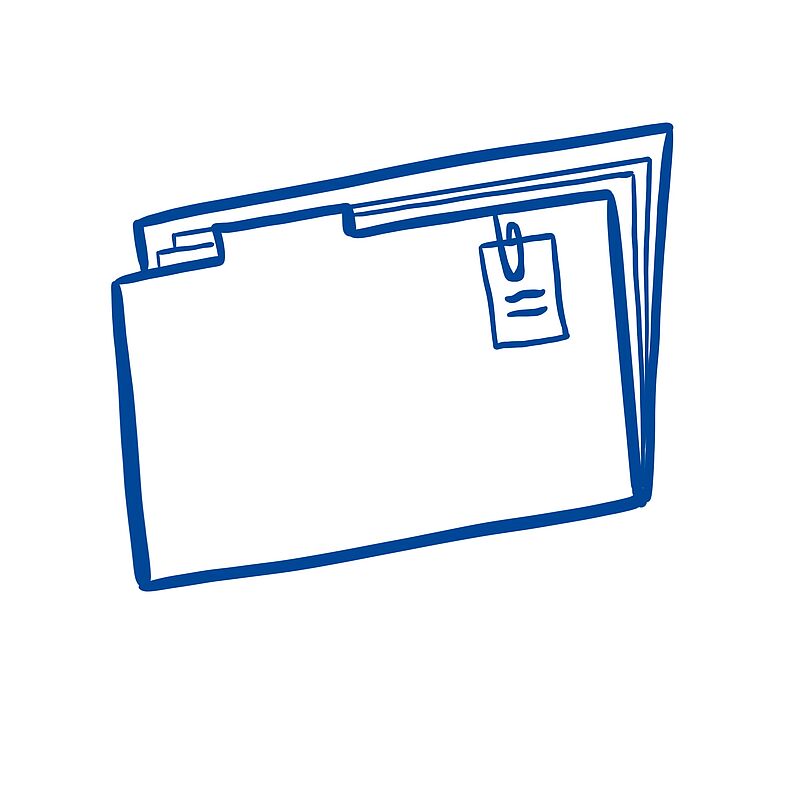
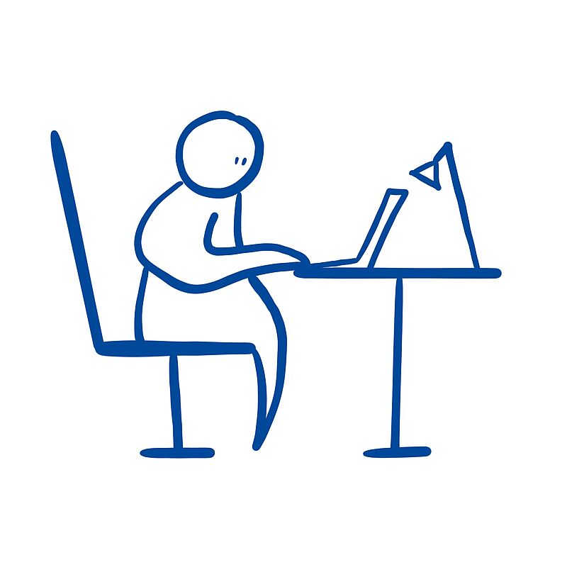
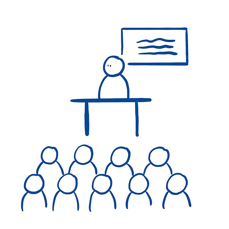
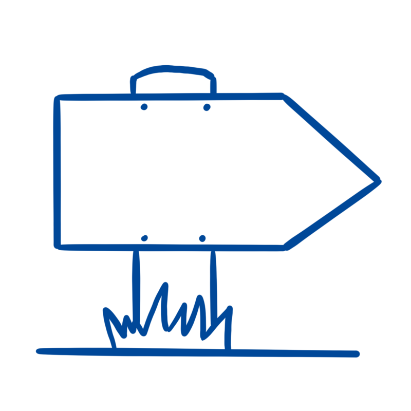
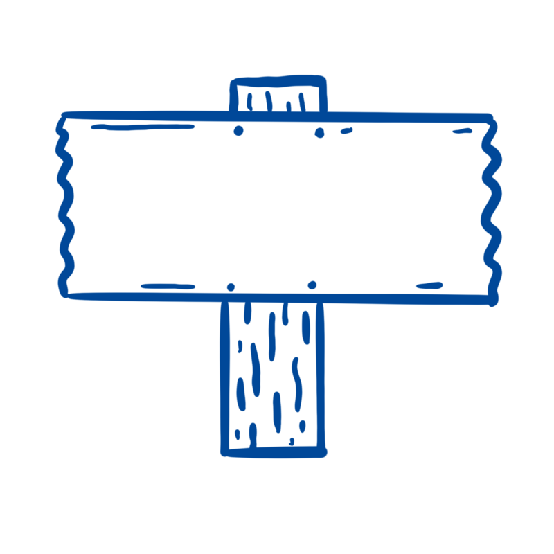
Office
Click on the image to get a step-by-step explanation on how to draw your scribble.


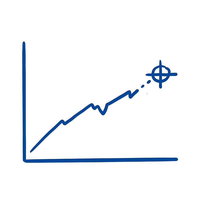
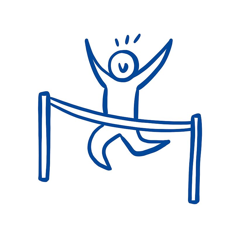
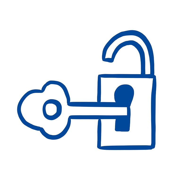
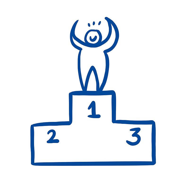
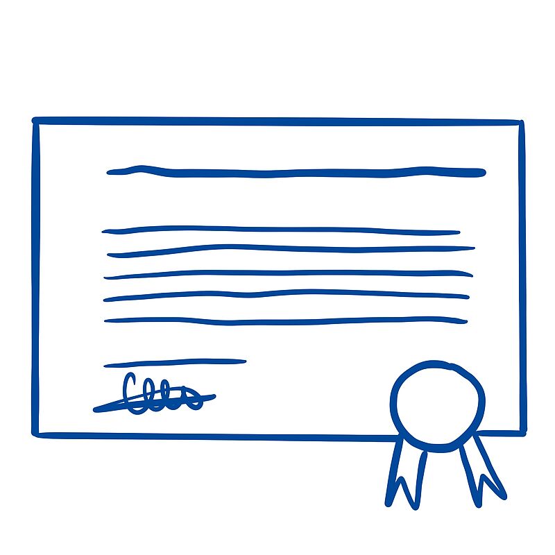
Success
Click on the image to get a step-by-step explanation on how to draw your scribble.


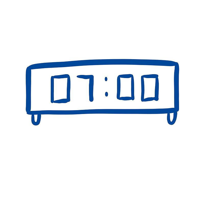
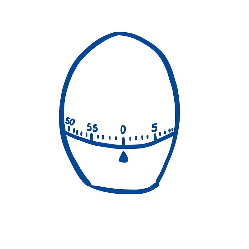
Time
Click on the image to get a step-by-step explanation on how to draw your scribble.


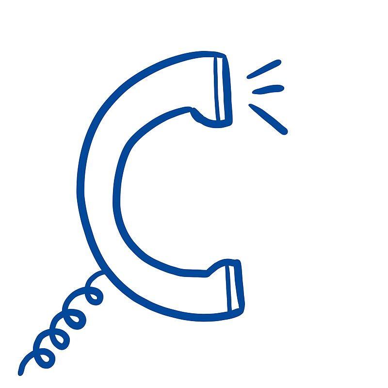
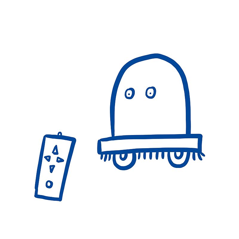
Communication and Technology
Click on the image to get a step-by-step explanation on how to draw your scribble.


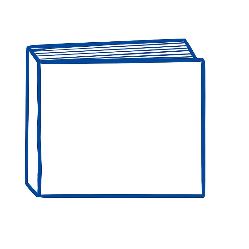
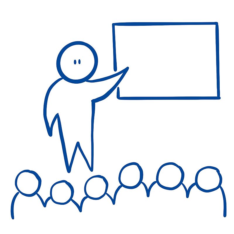
Knowledge and Education
Click on the image to get a step-by-step explanation on how to draw your scribble.

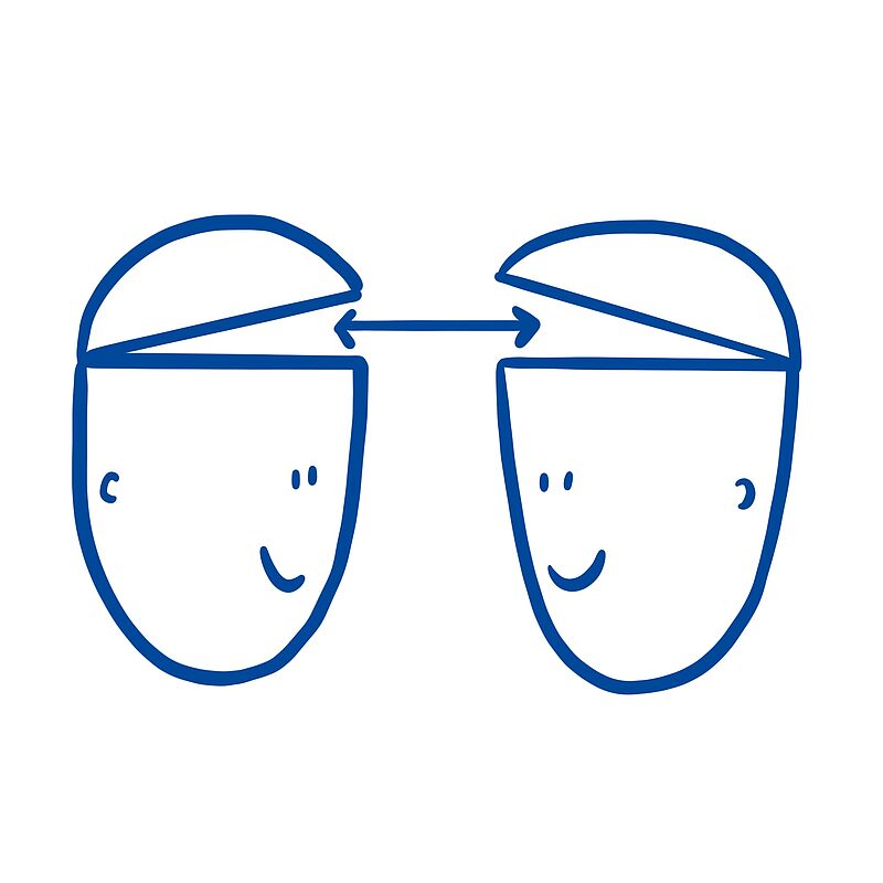
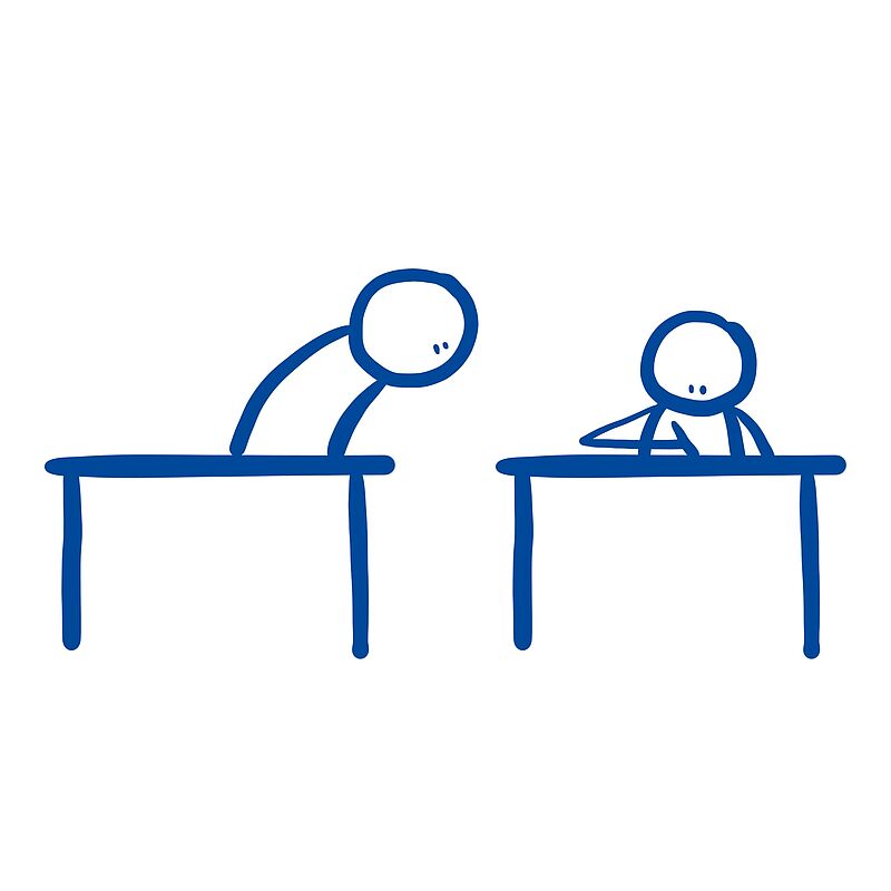


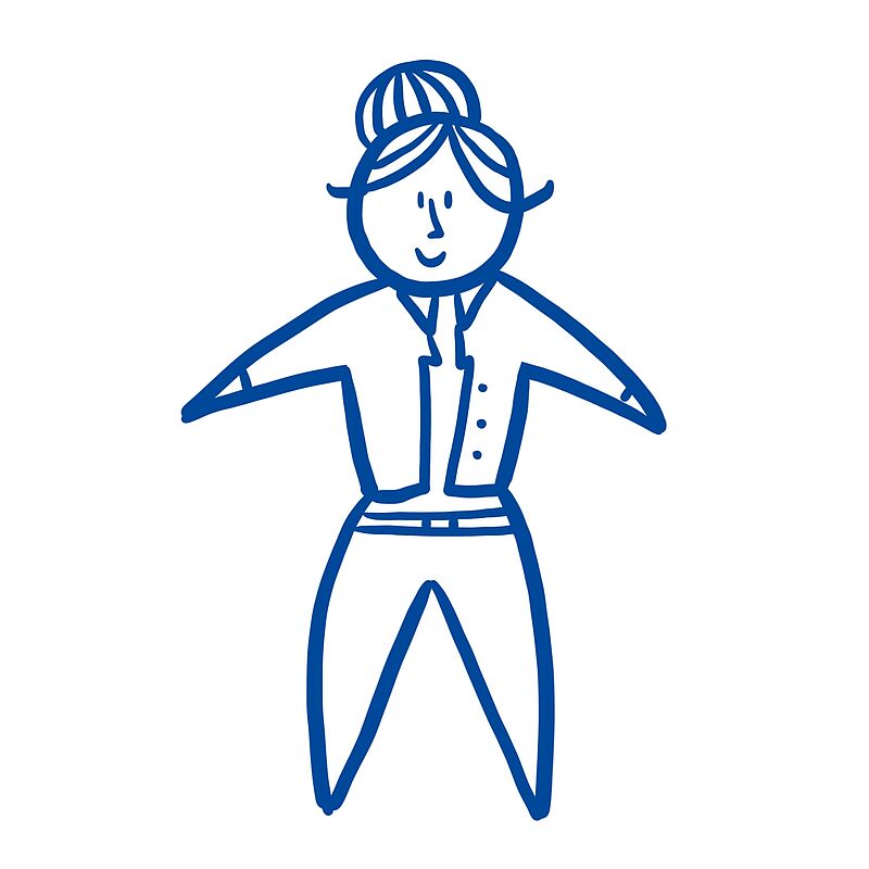
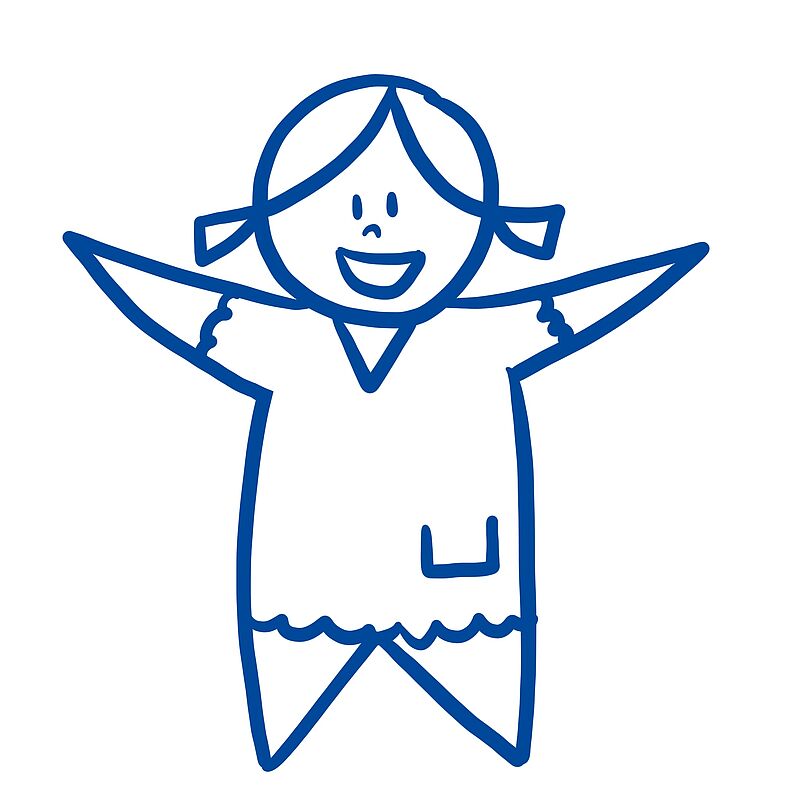
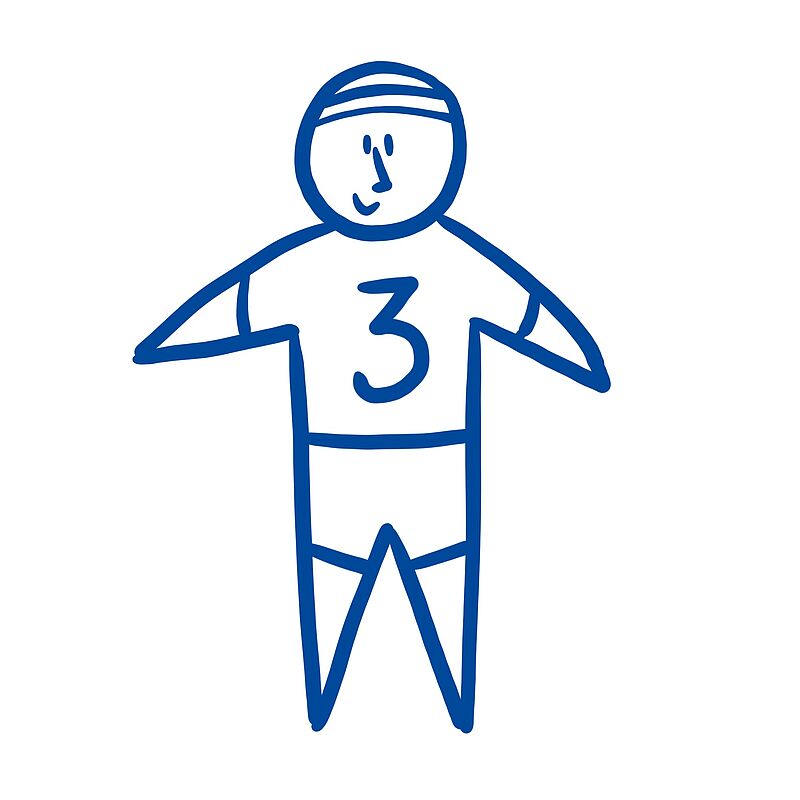
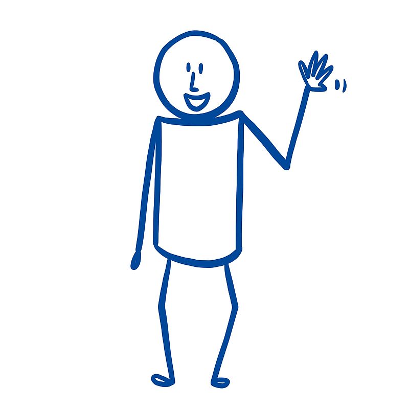
People and Expressions
Click on the image to get a step-by-step explanation on how to draw your scribble.


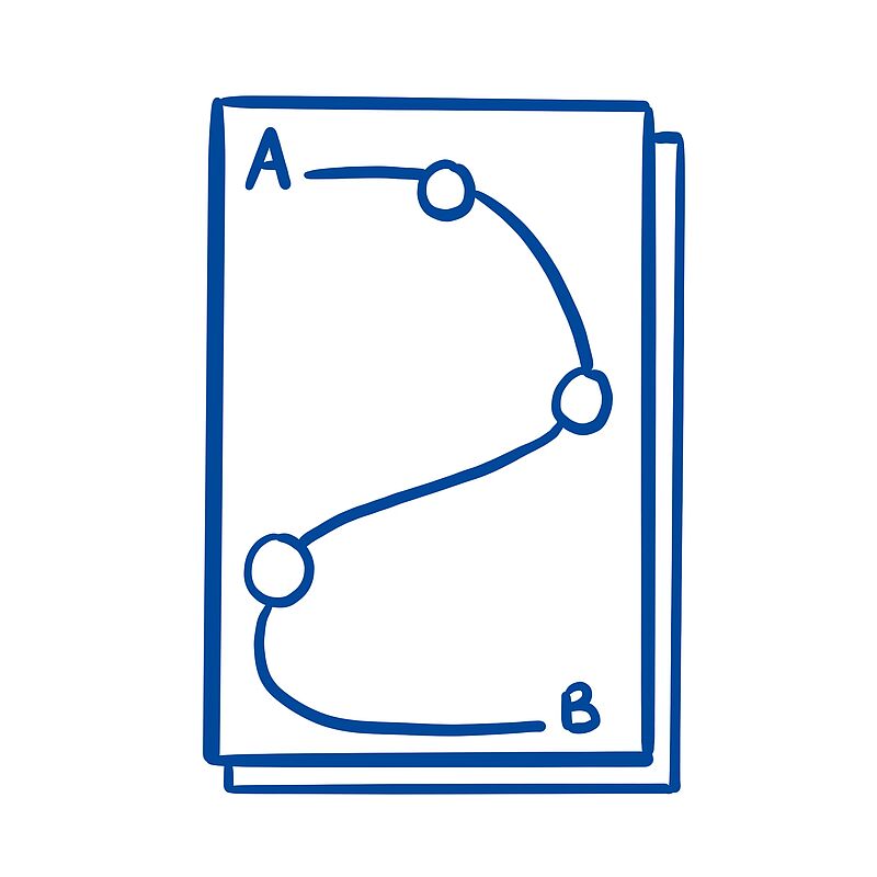
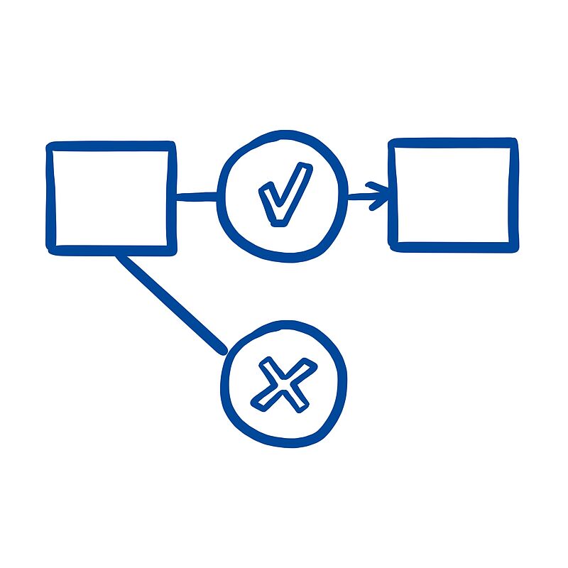
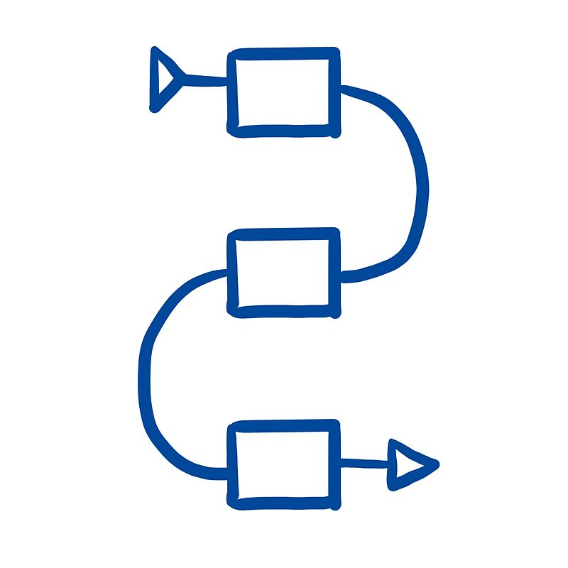
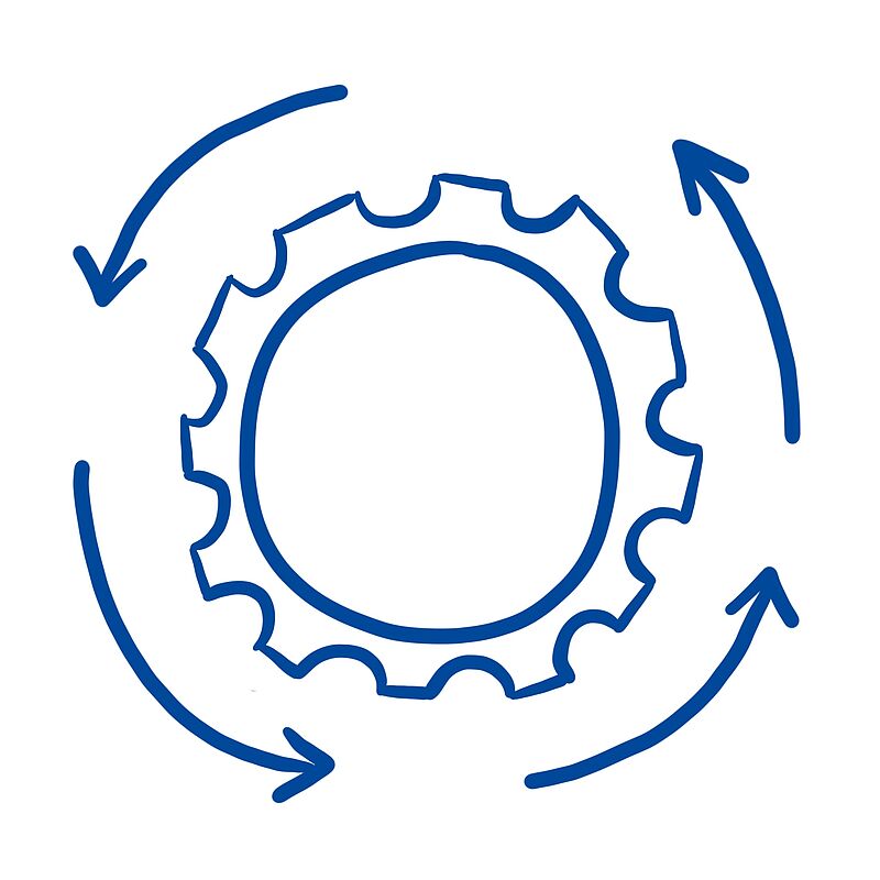
Projects and Processes
Click on the image to get a step-by-step explanation on how to draw your scribble.


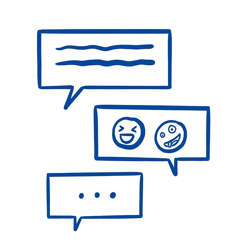
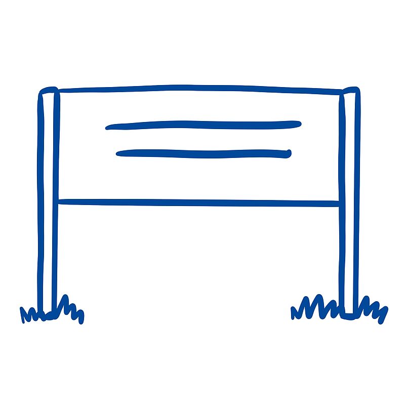
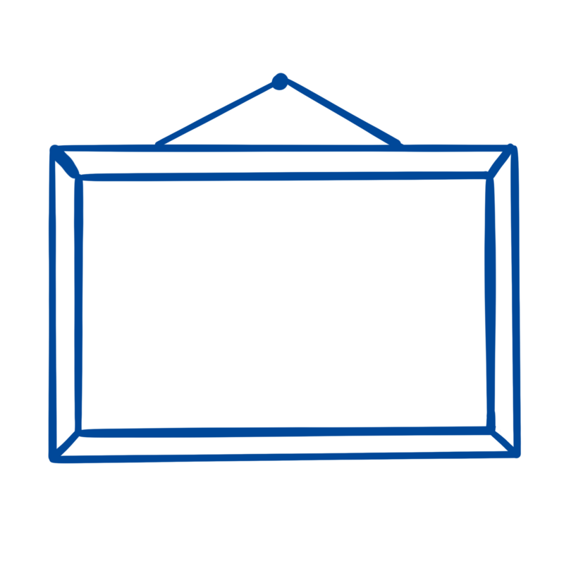
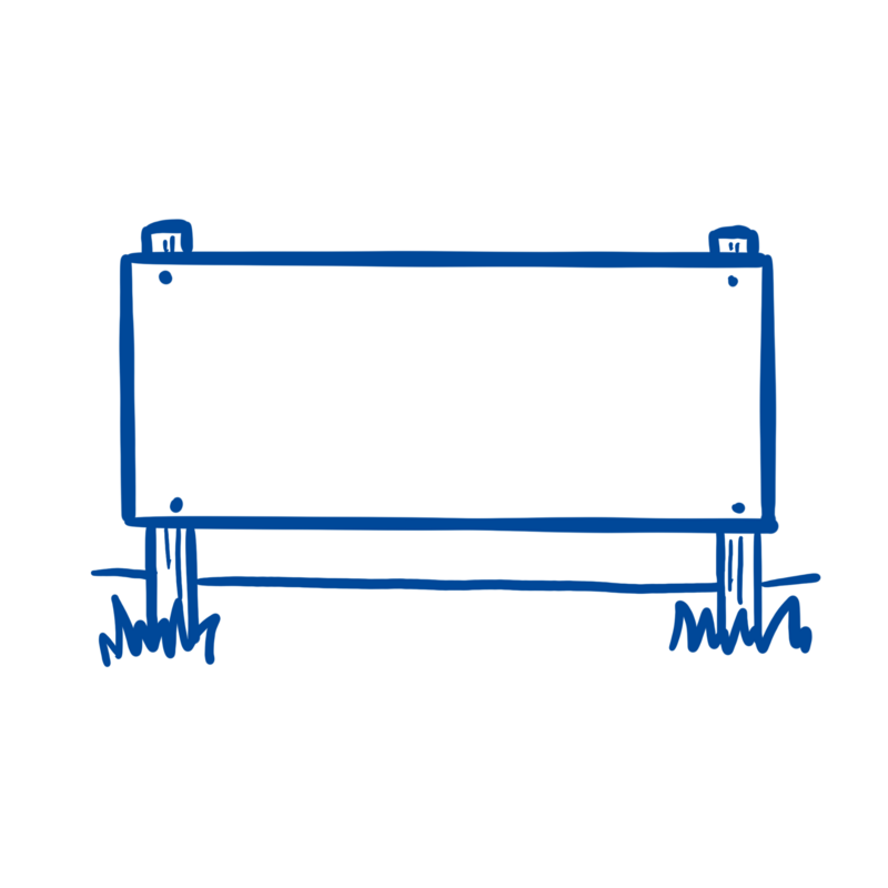
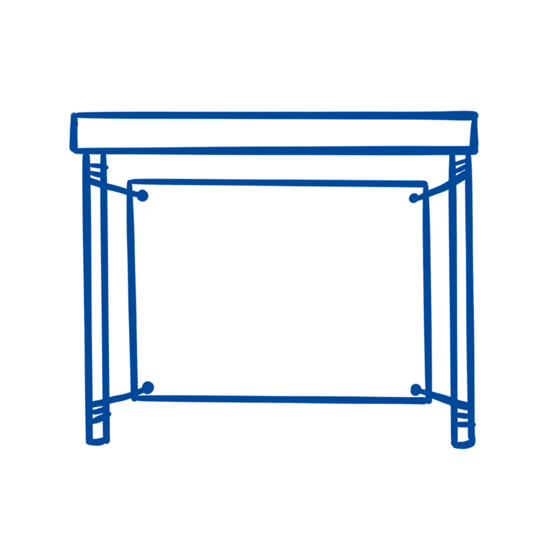
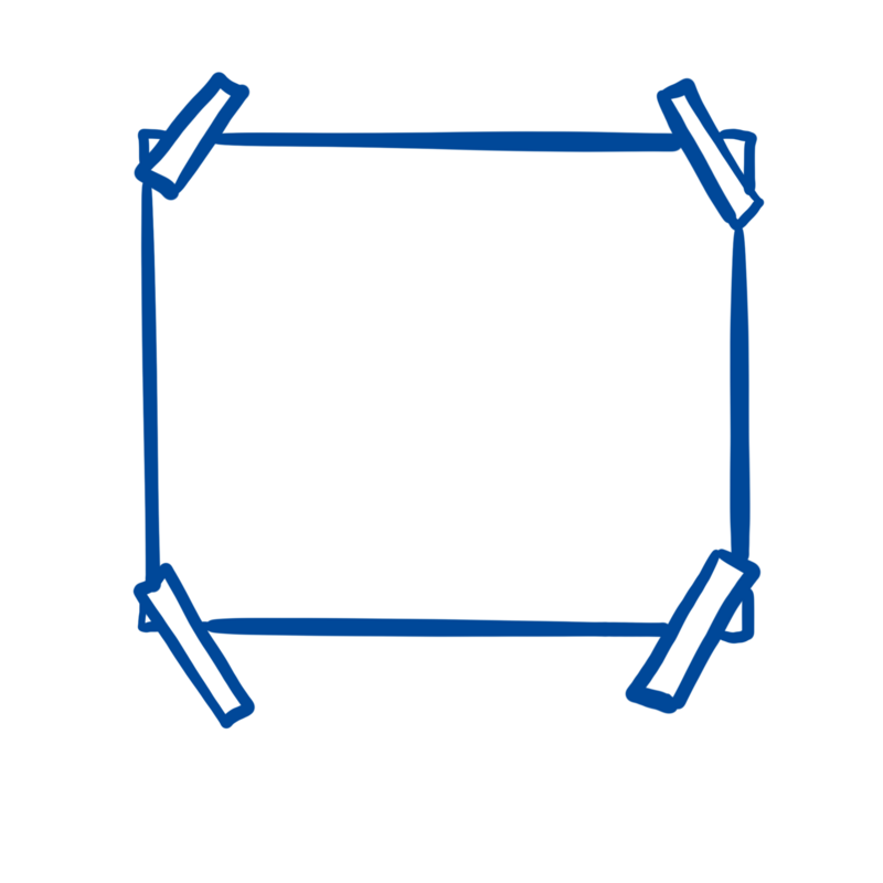
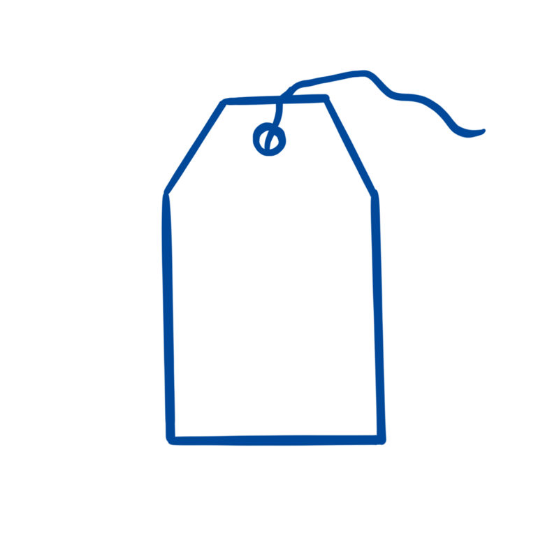
Рамки & Текстовые элементы
Click on the image to get a step-by-step explanation on how to draw your scribble.


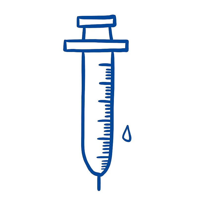
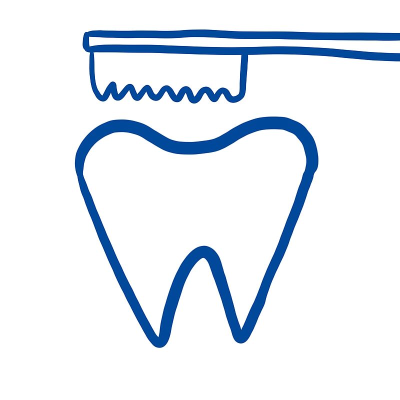
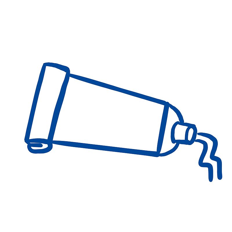
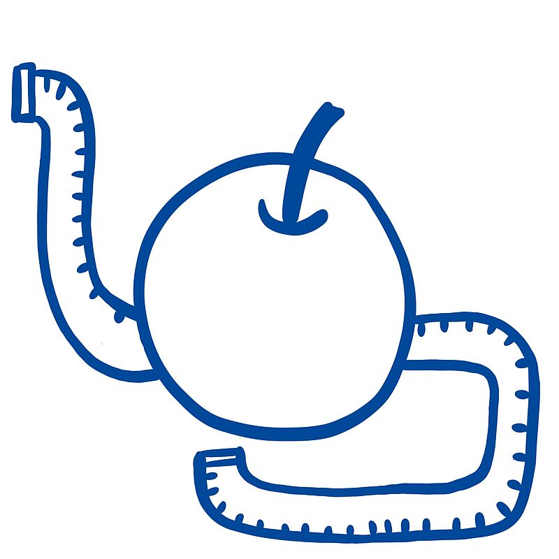
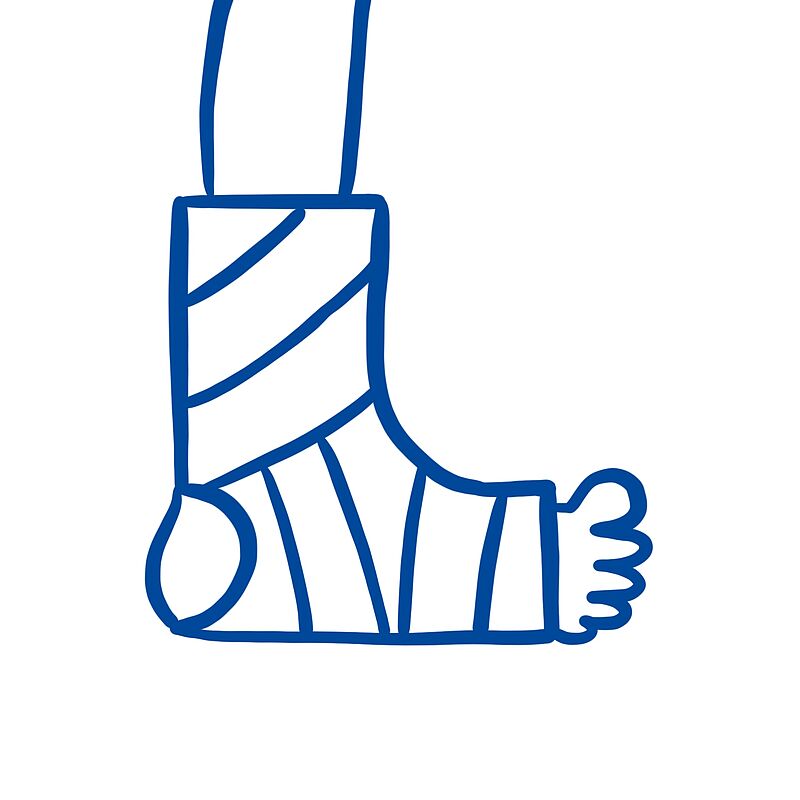
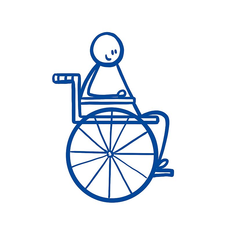
Body and Health
Click on the image to get a step-by-step explanation on how to draw your scribble.


Nature
Click on the image to get a step-by-step explanation on how to draw your scribble.


Downloads
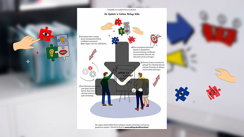
Как флипчарты помогают креативно проводить собрания
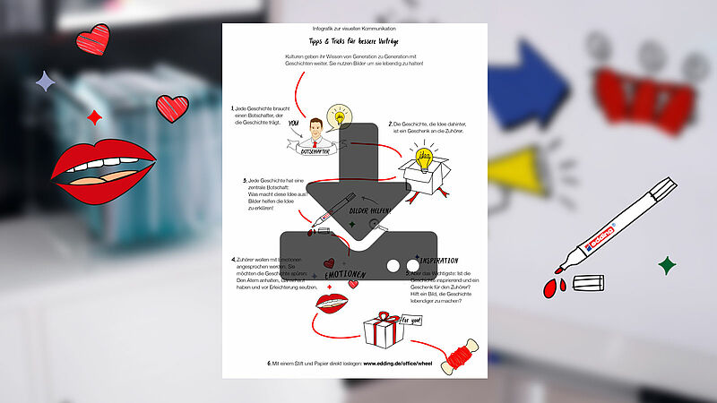
Советы и рекомендации по усовершенствованию докладов
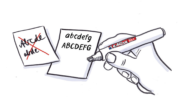
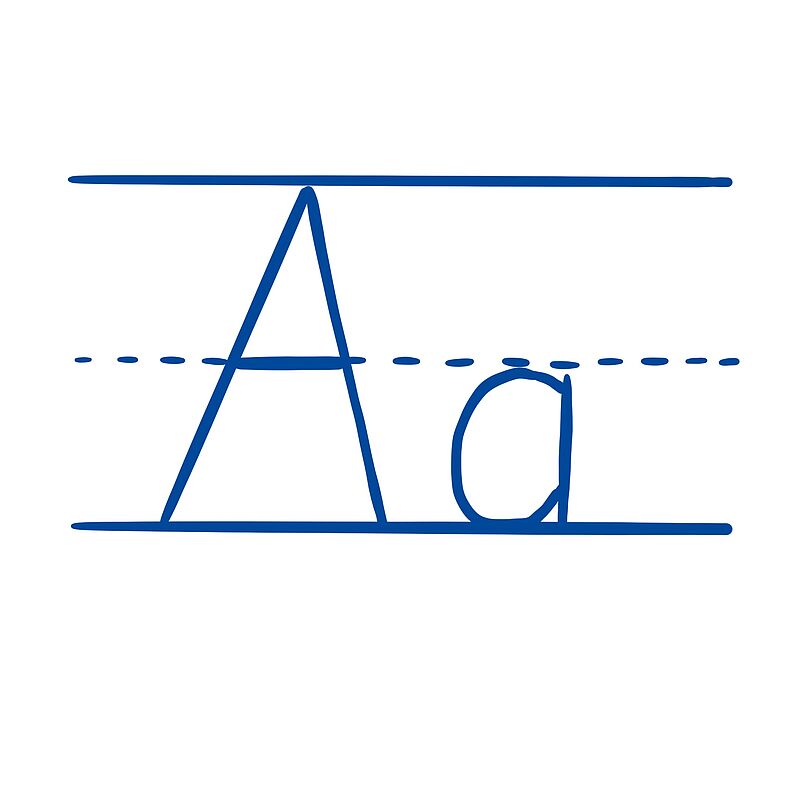
Печатные буквы распознаются лучше, чем прописные.
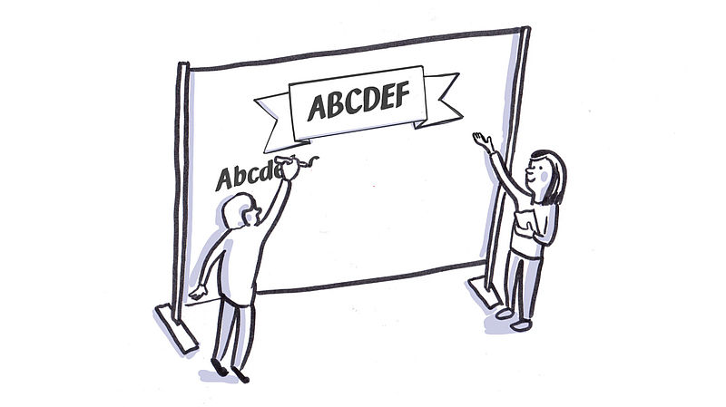
Используйте заглавные буквы только для того, чтобы выделить отдельные высказывания, или в заголовках; в других случаях комбинируйте заглавные и строчные буквы. Пропорциональные буквы придают всей надписи соразмерный вид и делают ее более удобочитаемой.